If you're new here, I've been sharing photos of the paper goods for my little sister Olivia's upcoming wedding. You can see the bridal shower invitations here and the save-the-dates here. But what I'm about to share blows everything else away.
Designed by our mother, Calligrapher & Graphic Artist Victoria Hoke Lane along with my soon-to-be-brother-in-law, Graphic Designer Joshua Berman, these wedding invitations are a perfect marriage of Liv's romantic, feminine side and the clean lines that Josh's work is known for. Enjoy!
 The suite consists of an invitation, reply card and envelope (no inner envelope due to the unusual shape/size of the invitation). Printing is in gold and chocolate brown on thick, textured ivory stock.
 With a sharpie marker for reference, you can see the scale of this invitation. It's BIG!
 Instead of the common "monogram," Olivia & Joshua chose to have their first names calligraphed on the invitation. I am in love with the scale of the design, and the writing going off the page!
 Here again is the "family crest" designed by Josh, seen previously on the back of the save-the-date.
 The R.S.V.P. card is a postcard, pre-addressed and stamped on the opposite side.
 The envelopes are addressed in an exquisite, perfect script by Victoria Hoke Lane.
 As on the invitation, the addressing is at a tilt and goes off the page. It is also at a large scale due to the immense size of the envelope. I cannot even begin to fathom how difficult that was to do. Victoria said it was one of the most time-consuming envelope-addressing jobs she has ever done in her 30+ years as a professional calligrapher!
 The envelopes were appropriately stamed with "LOVE" and a wedding cake. The attention to detail which goes into Victoria's work never ceases to amaze me. I used to help her stamp and seal envelopes when I was younger and I remember how perfectionistic she was about every detail. Do you see how precisely the stamps are affixed??? The edges match up perfectly!*
 Of course my husband and I "delightfully accept," and we returned the rsvp card by mail the day after receiving it. Don't forget, etiquette requires that you return an rsvp card within three days of receiving it.
*EDIT: My thirteen-year-old sister Maggie has commented to inform me that she affixed the perfectly aligned stamps. I remember doing that job when I was her age, so I know how difficult it is. Tres magnifique, Maggie!

 Design session {ll} :: Reading before bed {st}
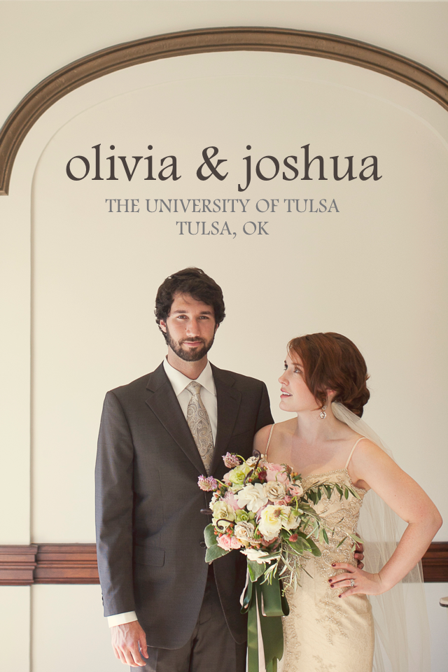


 Serendipity Cover


 The paper is a pale pink with gold lettering and chocolate brown typography.
 The envelopes are addressed in brown and stamped with a queen of hearts!
 Josh designed the "family crest," incorporating olive leaves as a nod to the origin of Olivia's name. I'll be using olive leaves in the floral decor, as well!
 Here you can see the texture of the paper : LOVE!


 Apologies for my lack of posting lately- I've been swamped with work, and while I've got lots and lots of content to share, I just haven't had the time to get it up here. Over the next few days I'll be doing a lot of "blog housekeeping," so if you're reading this via Google Reader or another RSS feed reader, beware! Who knows what might come through... I'm moving posts from the old blog over here, hitting "publish" on a few blog posts that I wrote but forgot to publish, and fixing missing pictures and broken links. Hopefully we'll be back to working order and regularly scheduled posting on Monday.


