winter white

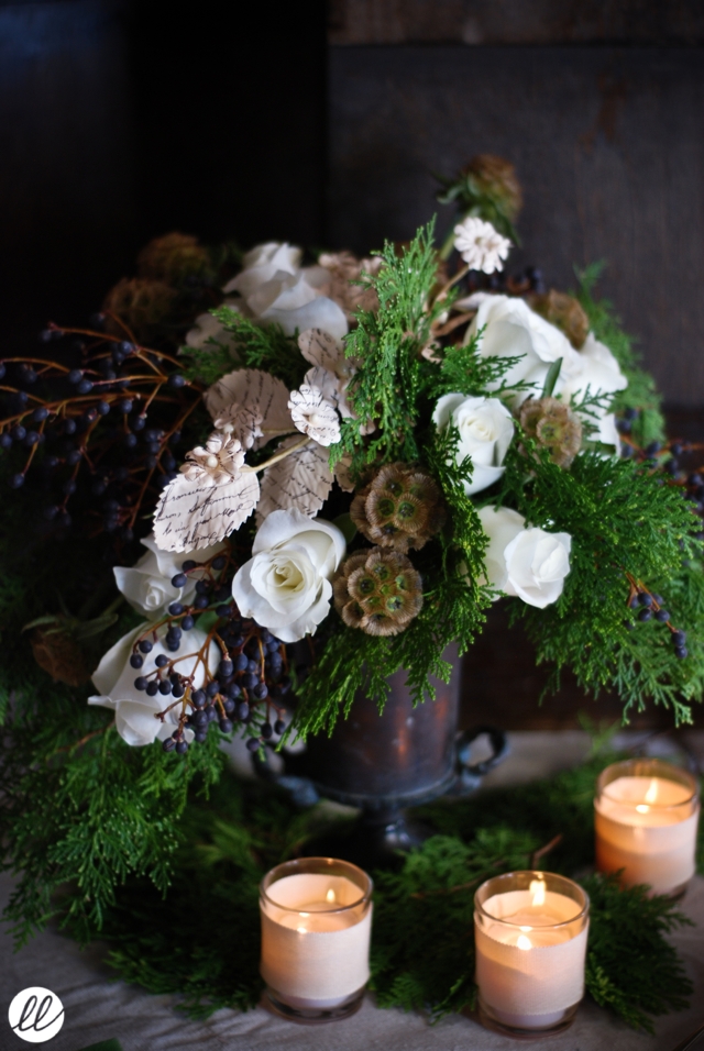
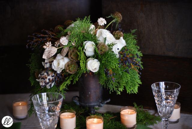
White and green is my favorite winter color combination. Wait, who am I kidding? White and green is definitely my favorite any-time color combination. My own wedding over six years ago was white, green and chocolate brown, and to this day that remains my favorite palette. The palette can be fresh and modern, or rustic and earthy-- either way, it always looks good!
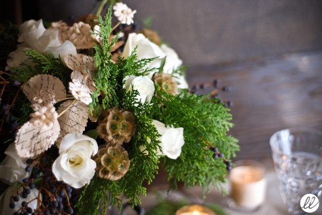
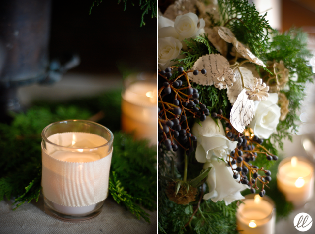
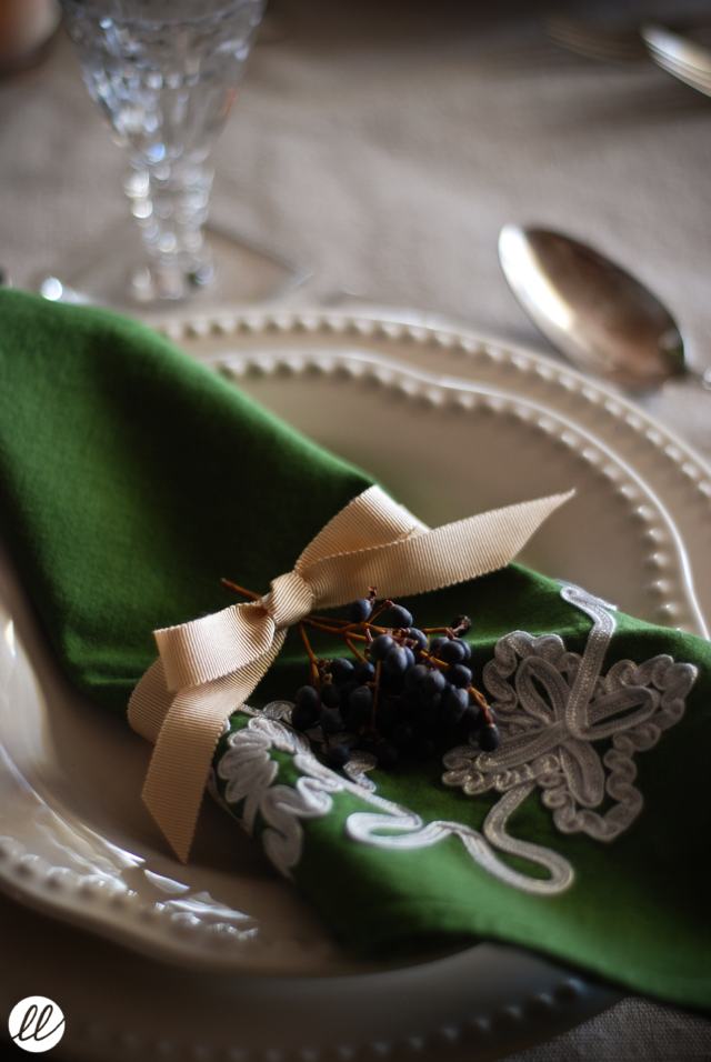
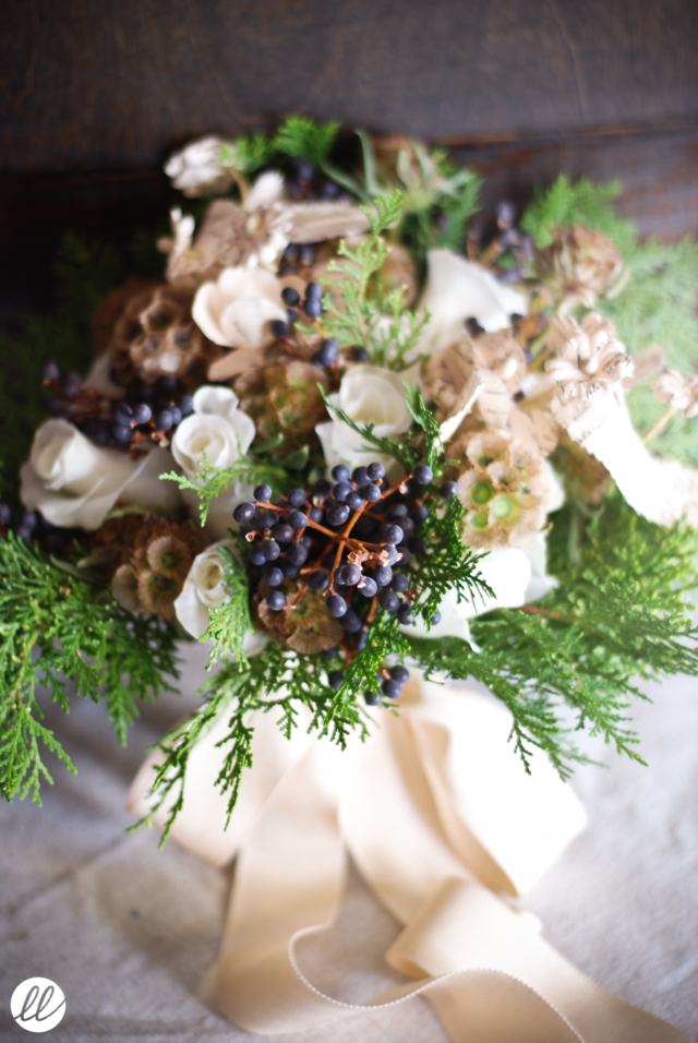
Here's a little table and bouquet that I designed recently, using holiday greenery, classic vendela roses, scabiosa pods, privet berries, and wonderful vintage-looking paper flowers with a pretty old-fashioned script! Of course, there's also some totally scrumptious (and uber expensive!) french grosgrain ribbon. Yummy! Enjoy!

Even though it's cold outside, this bouquet makes me feel warm and fuzzy. Flowers, designed well, can definitely banish wintertime woes!

Images | Floral Design | Styling by Lauryl Lane.
cake styling

Several years ago, a girl named Joy started a blog about baking. I started reading her blog. Then a while later, she had a blogiversy party in downtown Los Angeles, and I attended. I got to meet Joy and bring her some flowers. Joy and I follow each other on Twitter, and that's fun. But I was so suprised and delighted when I received an email from her a couple weeks ago, asking if she could hire me to design & style florals on a cake for her. Not just any old cake, but a cake that might possibly grace the cover of her first cookbook, due out early next year!

So last week, Joy came over to my house with a bright pink cake and a whole bunch of camera gear. I worked my floral magic, and then Joy took pictures. It was loads of fun, and Joy even blogged some fun photos afterwards!

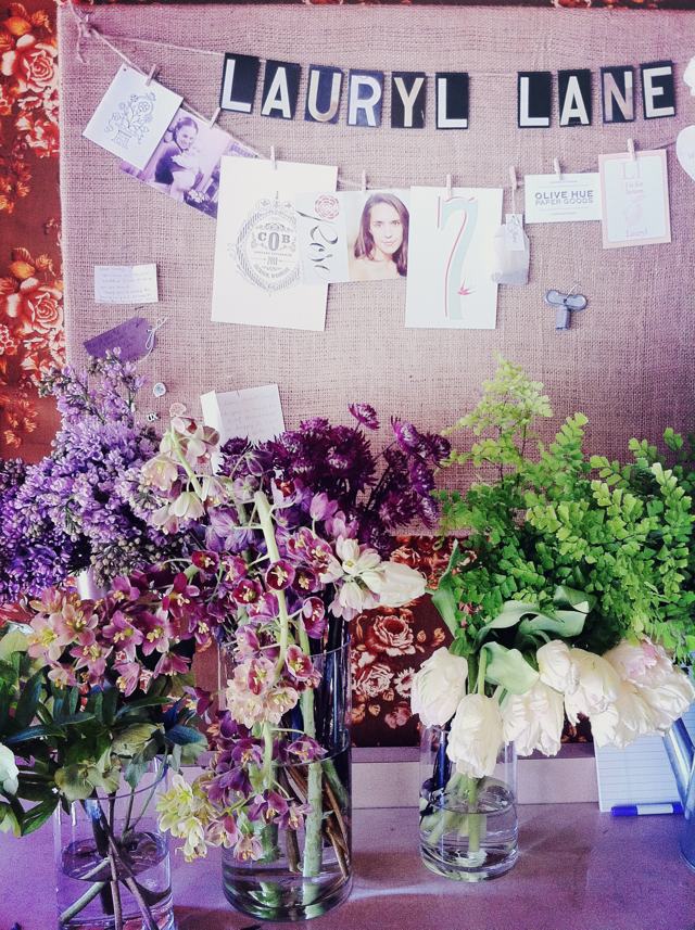
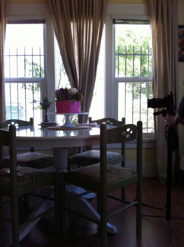
Personally, I took a grand total of 3 iPhone images. Bad me. I was having too much fun watching Joy shoot with her fancy-schmancy camera. So these are the flowers in the studio, all ready to work with. And the floralized cake on my dining room table, where Joy shot. The third photo is mostly of Joy's rear end, so I thought I'd hold onto it in case I ever need to blackmail her. Unlikely, though, since she's one of the nicest gals around. Congratulations on the cookbook, Joy! I can hardly wait to get it into my grubby (literally) little hands! xoxo

Images | Florals | Styling by Lauryl Lane.

romantic fleurs in santa barbara

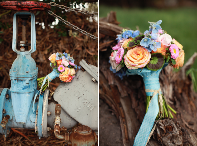
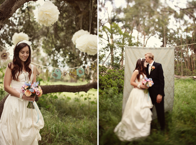
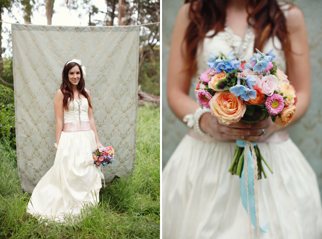
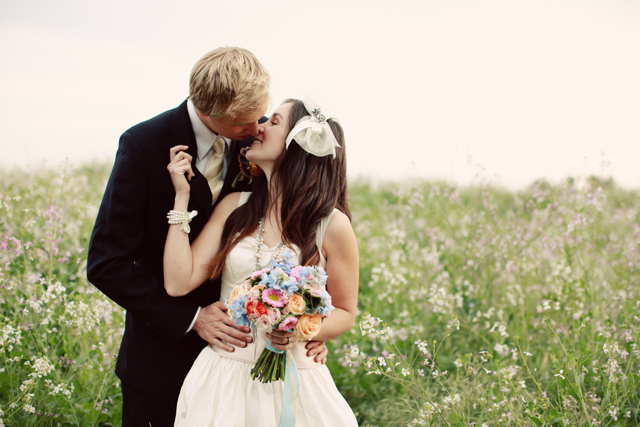
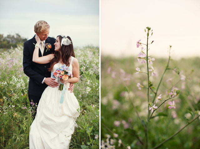
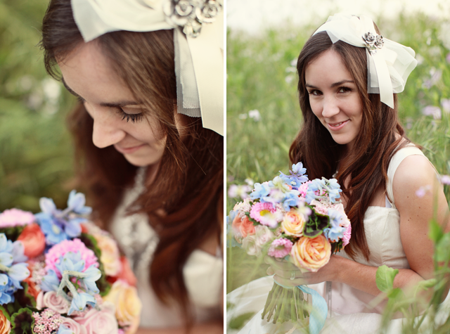
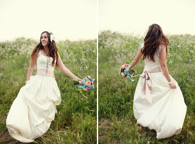
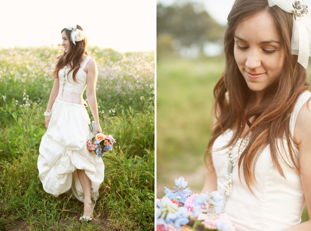
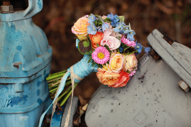
Not too long ago, Orange County photographer Richelle Dante hired me to design some florals for a shoot she was doing up in Santa Barbara. Richelle is a tremendous photographer and I am always so pleased when I get the chance to work with her. She basically gave me free reign to design, giving me just a basic color scheme and the general shoot aesthetic, "dreamy and green." The result? A totally sweet, uber romantic bouquet and boutonniere-- and these stunning photos from Richelle. Enjoy!

The bouquet featured roses, ranunculus, delphinium, asters and geranium leaves.

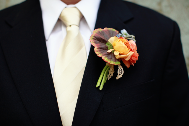
The boutonniere was made of two ranunculus blooms, a pinch of delphinium, and a geranium leaf, tied off with a bit of lace.

Positively dreamy!

Images by Richelle Dante.

Dark & Twisty

I can't believe I'm just now getting around to blogging these pictures. They've already been shared so many places (at Style Me Pretty, at Ever Ours, at Adrienne Gunde, at Olive Hue), but I feel the urge to share them again.

This shoot was utterly delightful in every way, and I was thrilled to be involved. The recent release of Disney's Alice in Wonderland generated a whole slew of Alice-themed photo shoots out here in the blogosphere, so when Lydia approached me with the concept of an Alice-themed photo shoot from a new perspective, I was totally game.

Instead of the typical color-schemes, vintage tea-parties, playing card themes, red roses, and other Alice-inspirations of similar fare, we chose to go a "dark and twisty" route, playing with a more distinctive and monochromatic color palette and a more mature version of Wonderland inspiration.

Our shoot was created under the guise of a bridal shower,

with paper goods designed by Jane Jeon of 

Olive Hue Paper

.

Jane also assisted me in hanging dozens of recycled glass jars from a tree.

An ambitious project, but I am utterly in love with the result.

In two low wooden boxes, I created mini wonderlands of moss, mushrooms, delphinium, anemones and thistle.

Jane calligraphed name tags onto teabags in place of place cards. Clever, eh?

Jane also created adorable menu cards for each place setting,

which I displayed using real mushrooms as easels.

Between my two "wonderland boxes," I used a manzanita branch to showcase old watch

faces, sourced by Lydia. The faces remind us of the ongoing "time" theme in AIW.

As for the bouquet, yes, those are mushrooms. Real mushrooms.

I feel like every wedding/shoot I design is more unique than the last.

I'm so grateful and so blessed to have the freedom and encouragement to

create things that are different and unexpected.

Thanks, ladies. You rock.

Photographs by

Adrienne Gunde

.

Floral Design by

Lauryl Lane (me!)

.

Concept/Sponsored by

Lydia Yeung

.

Paper goods by Jane Jeon of

Olive Hue Paper

.

{Styled by Lydia, Jane and Lauryl}

Much thanks also to my dear friend, Megan Buchner, for graciously agreeing to model for us at the very last minute!