last thanksgiving

Last year, my husband and I flew to Cleveland, Ohio, to be with my maternal side of the family for the Thanksgiving holiday. My uncle/godfather hosted Thanksgiving Dinner at his elegant condominium home in a high-rise overlooking Lake Erie. Everything my Uncle puts his hand to is successful, and Thanksgiving Dinner was no exception.

As I posted yesterday about the Thanksgiving Dinner that I hosted at my new home in Denver, I realized that I never posted pictures from Thanksgiving Dinner last year, even though I was recruited to design the floral decor. Better late than never, right? ;-)

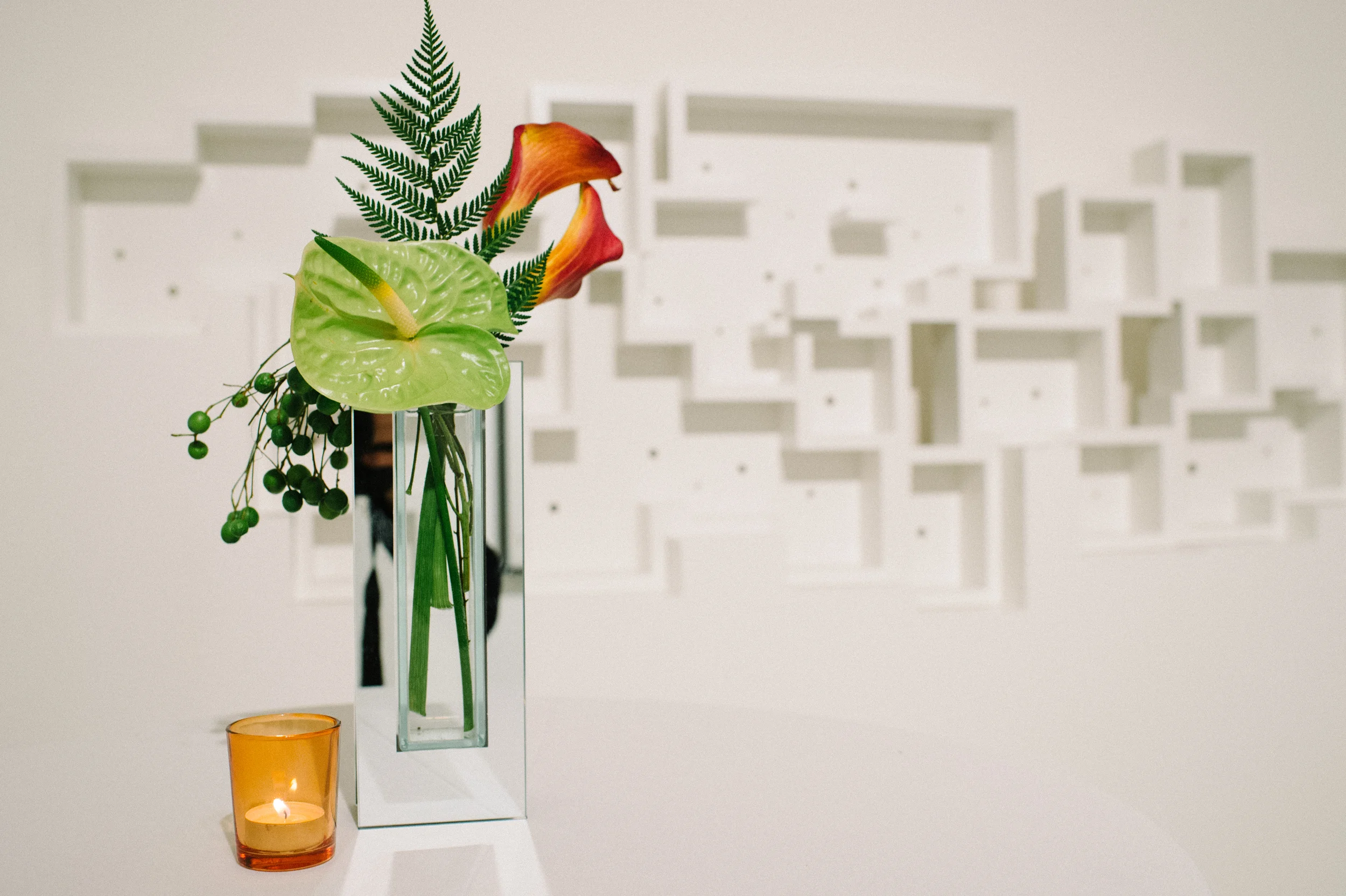
I created one very large mixed floral arrangement for the table, using assorted holiday greens, multi-colored roses, alstroemeria and wheat in a stunning silver and glass pedestal vessel.

I also added mini bud-vases down the center of the table with assorted roses and greenery. My uncle and his wife have very classic, sophisticated taste, and my designs were suited to the style of their home and the way they set the dinner table.

As is usual with family gatherings, my mother lent her hand to penning the place cards.

My cousin announced his engagement to his long-time girlfriend over this Thanksgiving dinner, and in September, we all joined them back in Cleveland for the wedding. Holidays and weddings: definitely a few of my favorite things!

Images | Floral Design | Styling by Lauryl Lane.

giving thanks

Whew! Has it really been a week since Thanksgiving? I had three visiting family members staying with me for nearly a week, so I'm still trying to get caught up on all the cleaning/laundry that ensues with houseguests. It was really wonderful though, to spend time with my mother and grandparents, and we had such a wonderful, relaxing time together.

We were joined by additional family members, for a total of eleven people around our Thanksgiving Dinner table. They came from Cleveland, Ohio; Tulsa, Oklahoma; Grand Junction and Colorado Springs, Colorado, and we were truly blessed that our family traveled from near and far to be with us on our first holiday in our new home city!

Although we are currently renting a small house, we didn't really have the space for eleven people. So we decided to get creative, and we actually served Thanksgiving dinner in our basement. The biggest room in our basement is long and narrow, and we have it divided into a den on one side and my office on the other, with a wall of curtains separating the spaces. So for Thanksgiving dinner, we moved the furniture to the edges of the room, pulled back the curtain, patched two tables together and covered them with a big tablecloth. We nabbed chairs from all over the house, not to mention the patio, so that we could provide a seat for every bottom. I was a little concerned that it would be too cold in the basement, or too unconventional, but nobody seemed to mind.

When you set a pretty table and ply people with good food and good booze... people tend to be very, very happy. ;-)

There wasn't much space on the table for decor, so I kept things simple with gold glittered trees, arrangements of holiday greens and gold roses, gold pinecone candlestick holders, and some assorted mini pumpkins.

My mother penned some placecards in her gorgeous handwriting, and provided her beautiful pressed-cookies as favors for each of our guests.

It was a lovely holiday. I hope your Thanksgiving was lovely, too. I think I should go eat some leftover pumpkin pie, now.

Images | Floral Design | Styling by Lauryl Lane.

plantscaping

The fourth season of Mad Men recently became available for instant viewing on Netflix, and {lovah} and I are obsessed. We'd been having serious Mad Men withdrawals, despite having watched and re-watched the previous three seasons! {lovah} is pretty convinced that he is a "Mad Man," and he likes to tell me that regularly. Admittedly, he sort of is. Entertainment P.R. isn't the same as Advertising, but the environment he works in and the mix of creative & purely-business-driven work that he does really is quite similar to what goes on a Sterling Cooper Draper Pryce. Minus the drinking at the office... although I'm quite certain he and his coworkers would do that too if they thought they could get away with it! {lovah} has a growing collection of skinny ties, plays 1960's music like it's going out of style (it is out style, right?), and collects vintage decanters. He loves smoking cigars, he loves to dress up, and he drinks his scotch neat. Recently, he moved into a new office, and the first thing he said to me was that he was going to decorate it like Donald Draper's office.

We've found him a perfect lamp and he's painting some abstract canvases (yeah, the guy paints- who knew?). He's planning to take one of his vintage decanters and some rocks glasses to the office (for water, of course!), but he really needed a plant. And what is a Mad Men-style plant? I really wasn't sure, but I decided to go modern, masculine and a little asian-influenced.

If you want to make something similar, this was a snap to put together...

You'll need a ceramic container, a plant, potting soil, large rocks, small decorative rocks or glass, and driftwood or another natural element. First, put a few cups of large rocks at the base of your container, they'll help guard against over-saturation if you accidentally add too much water. Then add some soil, place your plant in the center, and use a small cup to fill in with more soil around the plant's roots. Leave an inch or two of space at the top of the container, and then add your decorative rocks or glass. Add your other "natural element" artistically askance, and voila!!!

What do you think? Is it "Mad Men" enough? Do you have any other ideas for how I can help my {lovah} Mad Men-ize his office?

Image | Plant Design | Styling by Lauryl Lane.

latest obsession :: passion vine

Passion vine. Where has it been my whole life??? I've used it before, but not in a great while. I happened across it at the flower market when I was picking up my floral order for a recent wedding, and made a snap decision to incorporate it into that wedding's design. Now I'm obsessed. I literally cannot get enough.

If you've been following my design work for any length of time, you've probably figured out that I am drawn to the unpredictability of flowers. I'm a spontaneous person by nature, so part of the excitement I derive from using a perishable good as my artistic medium is just that-- it's ephemeral quality. The life-span of a cut flower or plant is fleeting, so, in effect, my job is creating temporary art installations! Of course I know how best to treat and condition each and every botanical element that I work with- any good designer is going to know everything they can about the technical aspects of their chosen medium. But the fun part of the design process is the fact that no two cut flowers are ever exactly the same. That each stem has a personality and mind of it's own. A different bend, a different quirk, whatever it is... flowers are individuals.

And passion vine? Well, passion vine is über quirky. It bends and curves and droops and straightens...it has rumply leaves and corkscrew tendrils that are simply fascinating. The movement of this vine is beautiful and inspiring. It is delicate and ethereal but also dark and passionate. When the buds open....ah....magic. They are bold, sexy, elegant, intricate... and utterly mesmerizing. But enough of my descriptions... see for yourself!

Passion vine, you complete me. Or at least, you complete my arrangements. I adore you.

Images | Florals | Styling by Lauryl Lane.

woodland nymph

Good morning! Today I'm working away in the studio on a wedding, but I thought I'd share some photos of a prototype tablescape that I created for one of my brides earlier this spring. This bride was working with me long-distance from her home in Michigan, but her mother came to meet with me and we sent photos to the bride while we discussed the prototype with her on the phone. I rarely do prototypes for my clients. I hate being tied down to something, which is essentially what happens when a sample is created and agreed upon. As an artist, I prefer having the artistic freedom of creating the design AS I'm designing it-- i.e., during the actual build of the wedding.

But in this case, the prototype was a very good thing. The bride had booked me quite far in advance, and so the vision for her wedding had evolved over time. This prototype viewing was important for figuring out if we were on the same page after all of the changes and tweaks to the overall vision. The bride's mother kept telling the bride that she felt that "woodland nymphs" might come scampering out of the tablescape at any time. While I loved that description, it wasn't the feel we were going for. In the end, this tablescape changed dramatically. Eventually, I'll show you pictures of the final tablescapes at the wedding. But for now, enjoy some "woodland nymph." ;-)

Images | Florals | Styling by Lauryl Lane.

rose crown

I was flipping through photos on my computer yesterday, and came across these precious shots of my baby niece. She's a rollicking two year old these days, but when she was five months old she came to visit me in L.A., and I took her to a graveyard to photograph her (of course). I made her a crown of pink spray roses, which she wore with one of MY ancient baby dresses. My Mum saves stuff like that.

Totally angelic, right?

Images | Florals | Styling by Lauryl Lane.

cake styling

Several years ago, a girl named Joy started a blog about baking. I started reading her blog. Then a while later, she had a blogiversy party in downtown Los Angeles, and I attended. I got to meet Joy and bring her some flowers. Joy and I follow each other on Twitter, and that's fun. But I was so suprised and delighted when I received an email from her a couple weeks ago, asking if she could hire me to design & style florals on a cake for her. Not just any old cake, but a cake that might possibly grace the cover of her first cookbook, due out early next year!

So last week, Joy came over to my house with a bright pink cake and a whole bunch of camera gear. I worked my floral magic, and then Joy took pictures. It was loads of fun, and Joy even blogged some fun photos afterwards!

Personally, I took a grand total of 3 iPhone images. Bad me. I was having too much fun watching Joy shoot with her fancy-schmancy camera. So these are the flowers in the studio, all ready to work with. And the floralized cake on my dining room table, where Joy shot. The third photo is mostly of Joy's rear end, so I thought I'd hold onto it in case I ever need to blackmail her. Unlikely, though, since she's one of the nicest gals around. Congratulations on the cookbook, Joy! I can hardly wait to get it into my grubby (literally) little hands! xoxo

Images | Florals | Styling by Lauryl Lane.

(500 days of summer) wedding feature

Serendipity Cover

Last week, I finally got my hands on a copy of the Serendipity magazine's Summer 2010 issue. I did concept design, styling and florals for a photo shoot for the magazine, inspired by the film (500) Days of Summer. I shared photos from the incredible Sarah Yates here. It's so fun to see the final print version after months of planning and preparation! Please pick up your own copy today and help support the print magazine industry!

Pretty, pretty, huh? I might have some shots of my own to share soon... ;-)

Dark & Twisty

I can't believe I'm just now getting around to blogging these pictures. They've already been shared so many places (at Style Me Pretty, at Ever Ours, at Adrienne Gunde, at Olive Hue), but I feel the urge to share them again.

This shoot was utterly delightful in every way, and I was thrilled to be involved. The recent release of Disney's Alice in Wonderland generated a whole slew of Alice-themed photo shoots out here in the blogosphere, so when Lydia approached me with the concept of an Alice-themed photo shoot from a new perspective, I was totally game.

Instead of the typical color-schemes, vintage tea-parties, playing card themes, red roses, and other Alice-inspirations of similar fare, we chose to go a "dark and twisty" route, playing with a more distinctive and monochromatic color palette and a more mature version of Wonderland inspiration.

Our shoot was created under the guise of a bridal shower,

with paper goods designed by Jane Jeon of 

Olive Hue Paper

.

Jane also assisted me in hanging dozens of recycled glass jars from a tree.

An ambitious project, but I am utterly in love with the result.

In two low wooden boxes, I created mini wonderlands of moss, mushrooms, delphinium, anemones and thistle.

Jane calligraphed name tags onto teabags in place of place cards. Clever, eh?

Jane also created adorable menu cards for each place setting,

which I displayed using real mushrooms as easels.

Between my two "wonderland boxes," I used a manzanita branch to showcase old watch

faces, sourced by Lydia. The faces remind us of the ongoing "time" theme in AIW.

As for the bouquet, yes, those are mushrooms. Real mushrooms.

I feel like every wedding/shoot I design is more unique than the last.

I'm so grateful and so blessed to have the freedom and encouragement to

create things that are different and unexpected.

Thanks, ladies. You rock.

Photographs by

Adrienne Gunde

.

Floral Design by

Lauryl Lane (me!)

.

Concept/Sponsored by

Lydia Yeung

.

Paper goods by Jane Jeon of

Olive Hue Paper

.

{Styled by Lydia, Jane and Lauryl}

Much thanks also to my dear friend, Megan Buchner, for graciously agreeing to model for us at the very last minute!